Origins
Designing meaning
into baby names
A concept app that turns an overwhelming decision into a guided, emotional journey.
Role: Product Designer
Tools: Figma, Claude
Timeline: 4 weeks
Year: 2025
How the idea started
I was talking with a friend (who's also a developer) and somehow we got on the topic of baby names.
We started throwing out names we liked, and within minutes realized we couldn't really explain why we liked them.
Was it the sound? The meaning? Something else?
If we couldn't figure this out in a casual conversation, what's it like for people actually naming their child?
I tested existing baby name apps and they were all the same: alphabetical lists with no guidance or meaningful context.
The problem was clear. We decided to build something better together.
My role
Led end-to-end research, interaction design, and a full design system to explore a more guided, meaningful experience.
The team
I collaborated closely with a developer, using Figma Dev Mode and Cursor to keep the implementation aligned with the design system and interaction details.
The challenge
Naming a child is deeply personal. Yet most baby name apps treat it like a database.
After testing existing apps I found out problems across existing apps:
- Overwhelming alphabetical lists with no guidance
- Generic, repetitive name meanings
- Missing cultural and symbolic context
- No clear path for exploration
The question became:
How do we help parents discover names that actually mean something to them, instead of just scrolling through endless lists?
Understanding the Problem
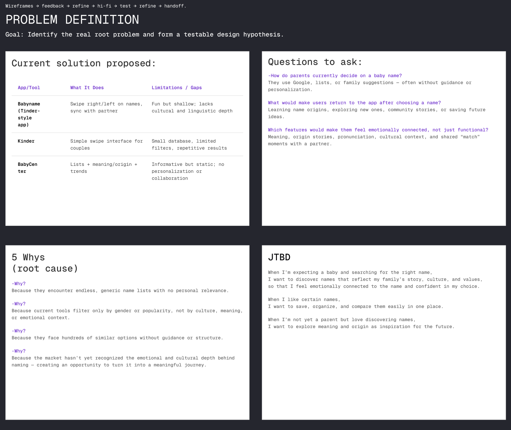
I began by validating early observations through a competitive analysis of the most popular baby name apps. Despite different interfaces, most products relied on the same pattern: A–Z lists, basic filters, and swipe interactions with little context.
This confirmed that the core issue wasn’t a lack of options, but a lack of structure and guidance.
I started with competitive research, testing and reviewing existing baby name apps and online resources. Most products relied on alphabetical lists, popularity rankings, and generic filters, with little context.
I then researched how people naturally talk about names across forums, articles, and discussions.
I noticed that names are often described and grouped by culture, religion, and historical context.
These themes appeared repeatedly as reference points people use to explain and explore names.
Based on this, I identified cultural, religious, and historical context as the primary entry points for exploration. These categories became the foundation for the first low-fidelity prototypes.
Low-fidelity exploration
I started by sketching different ways parents could begin their search, like a search bar, browsing by letter, or choosing from categories.
Category based exploration felt more intentional and guided. Instead of aimlessly scrolling, users could choose a direction that resonated with them.
The approach
Based on what I learned from early testing, I focused the design around three key principles:
Start with themes, not lists

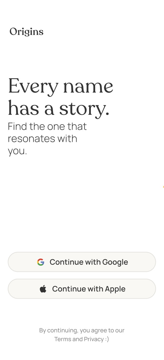
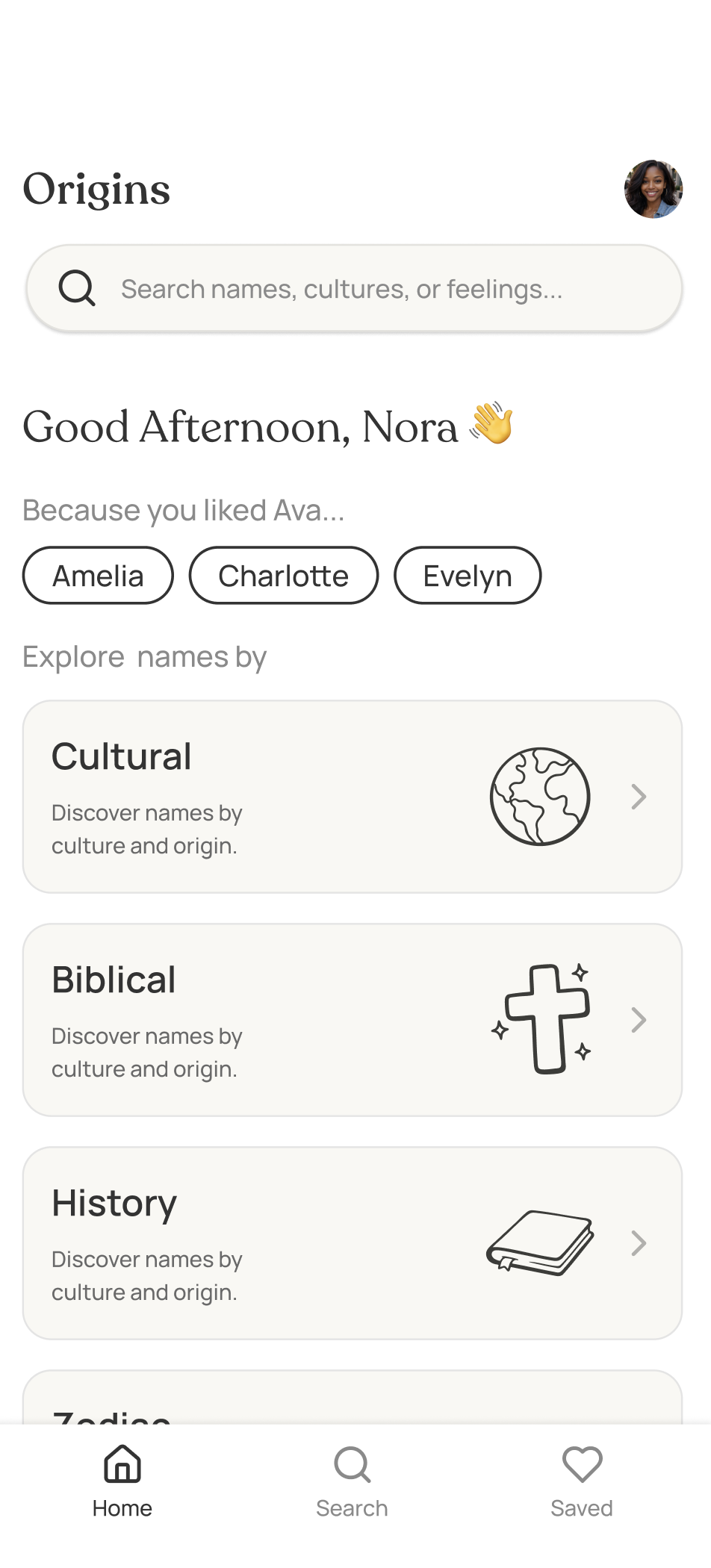
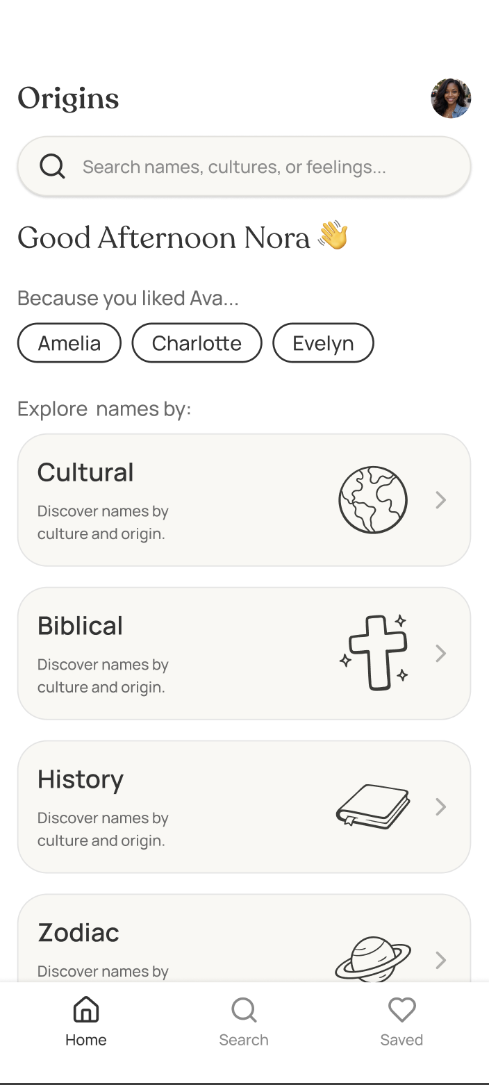
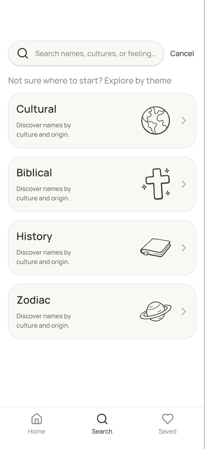
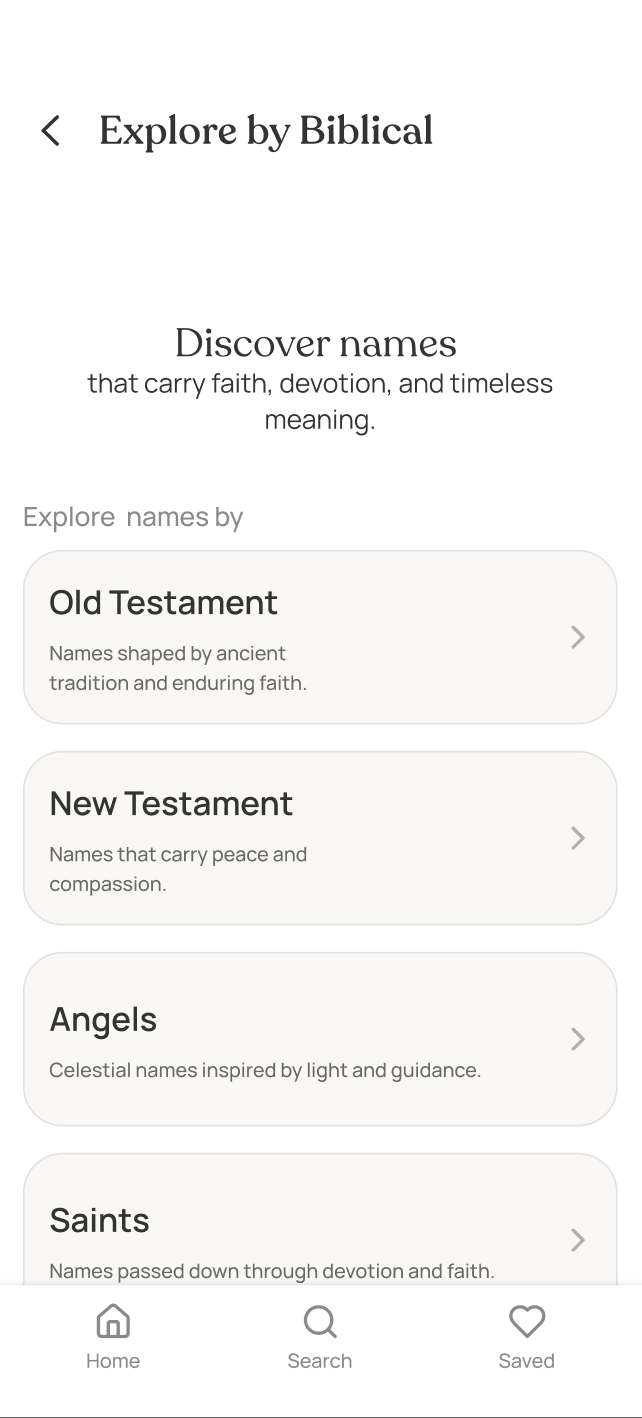
The app starts with themes instead of alphabetical lists. Users choose a direction: biblical, cultural etc, then explore names within that context. This gives structure to what's typically an overwhelming decision.
Clear entry points into exploration

You start with broad themes, so you're not staring at a blank search box wondering where to begin. Pick a direction that feels right, then go from there.
Stories, not summaries

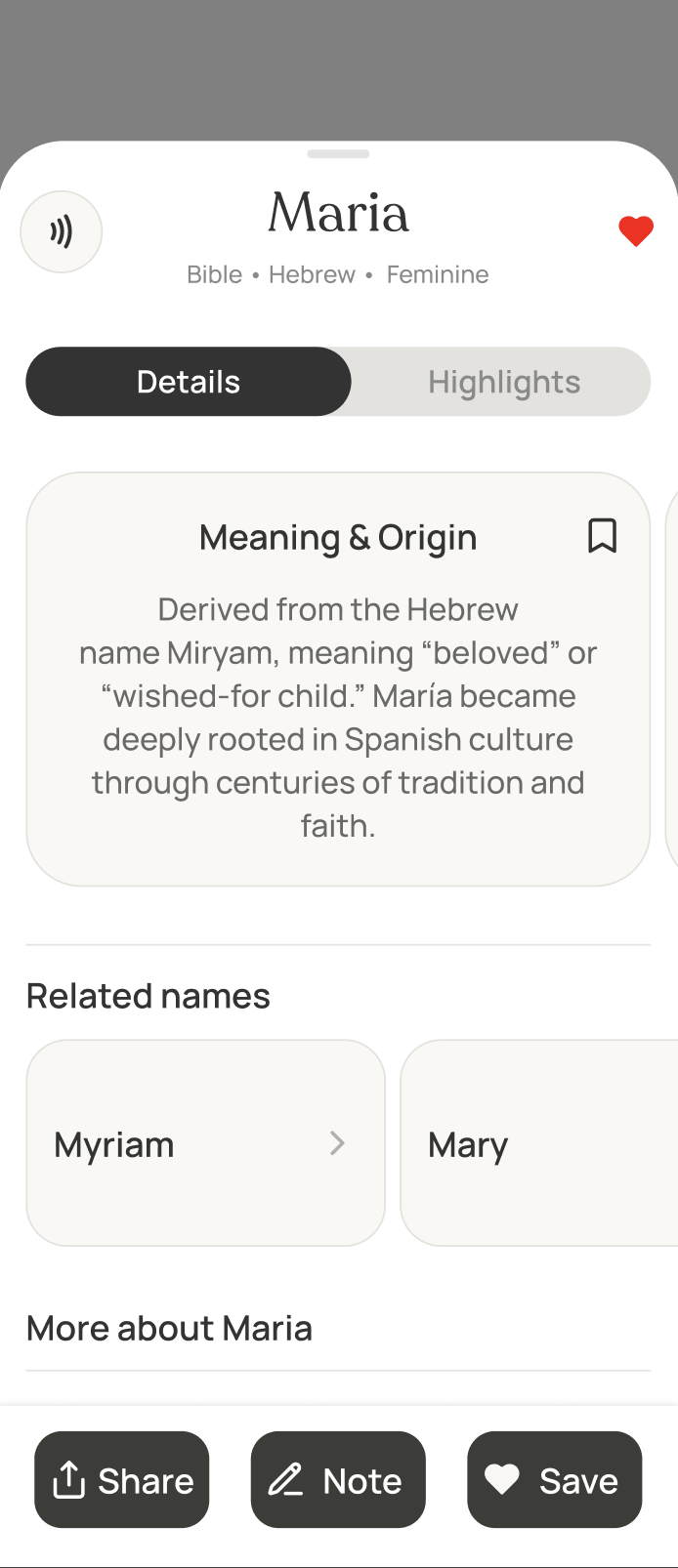
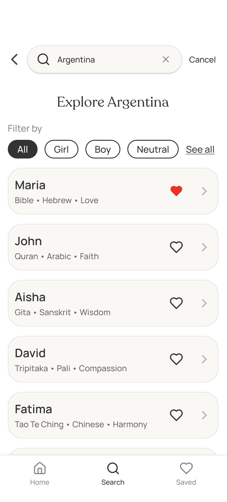
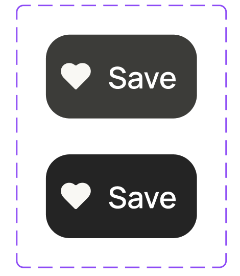
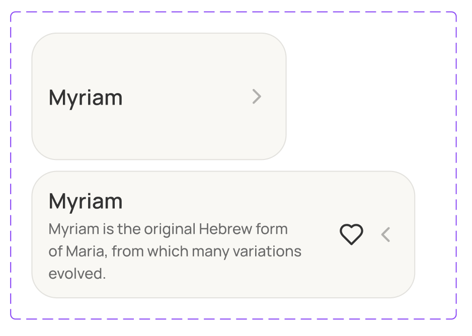
Each name includes its origin story, cultural significance, pronunciation guide, and connections to related names.
Instead of just "Maria" users learn about its biblical roots, cultural variations, and why it resonates with different cultures. This gives parents the context they need to make an informed, meaningful choice.
Designing with
relationships in mind
As meanings, origins, and cultural context emerged as core user needs, I collaborated with the developer to explore how this information could stay connected beneath the interface.
We used a knowledge graph to map relationships between names, origins, symbolism, phonetics, and related concepts helping us think beyond isolated name cards and toward a system designed for discovery.
Final Designs
Here's how the experience comes together across the core screens:
Home screen
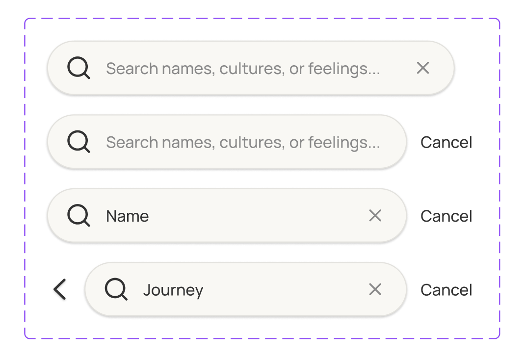
Search & Explore
Browse names
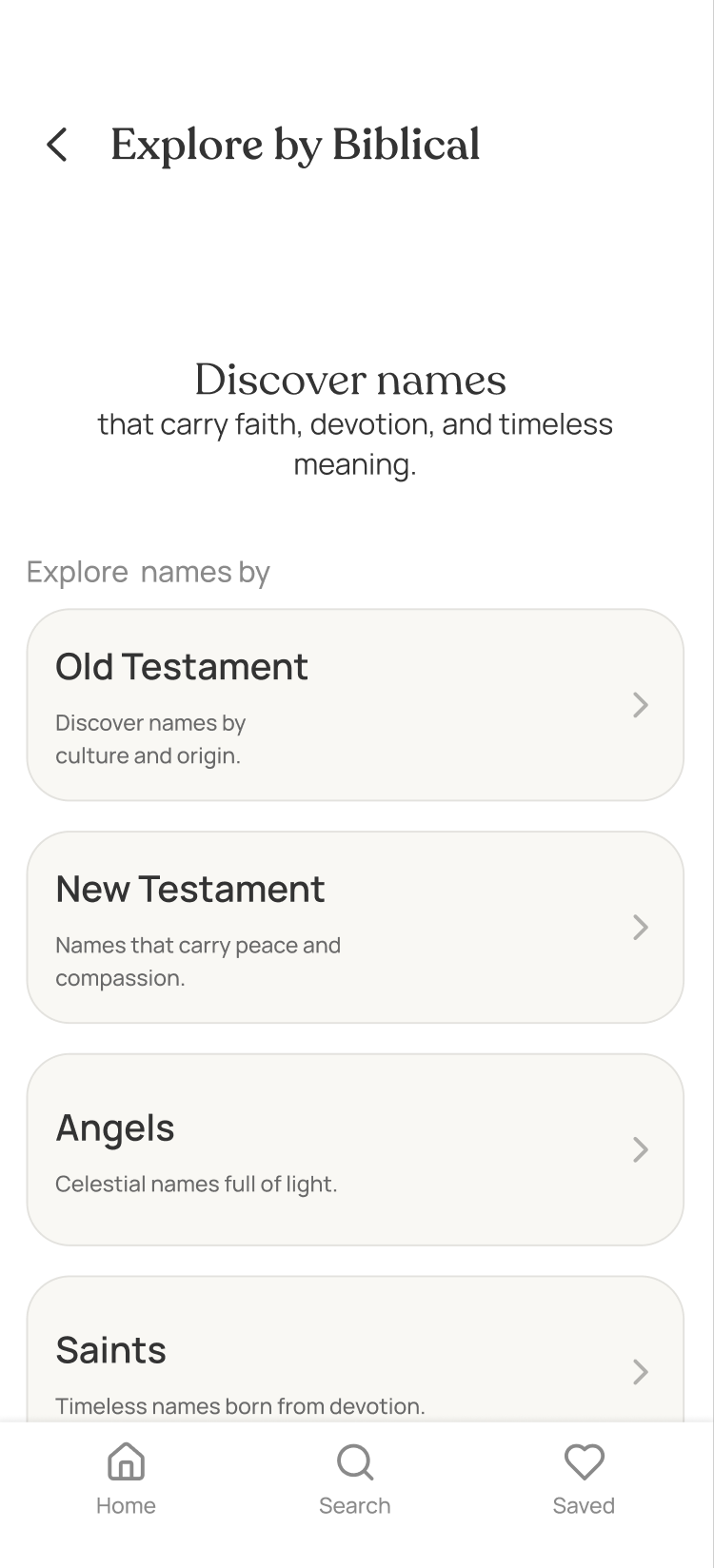
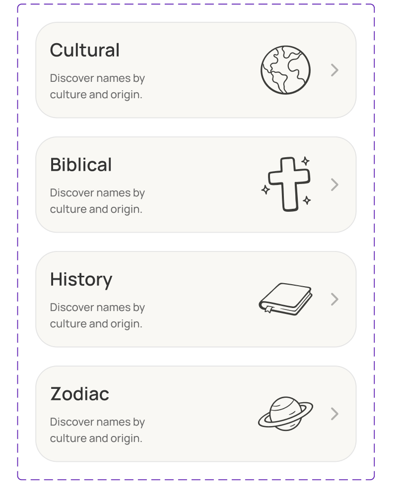
Category exploration
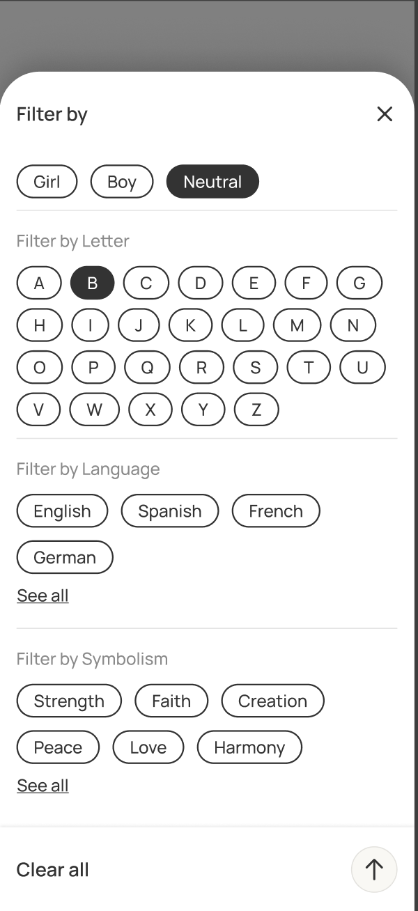
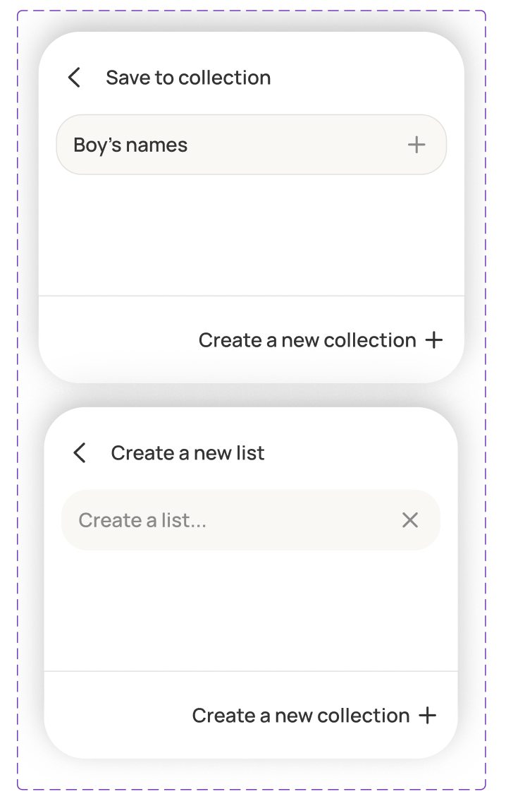
Filters
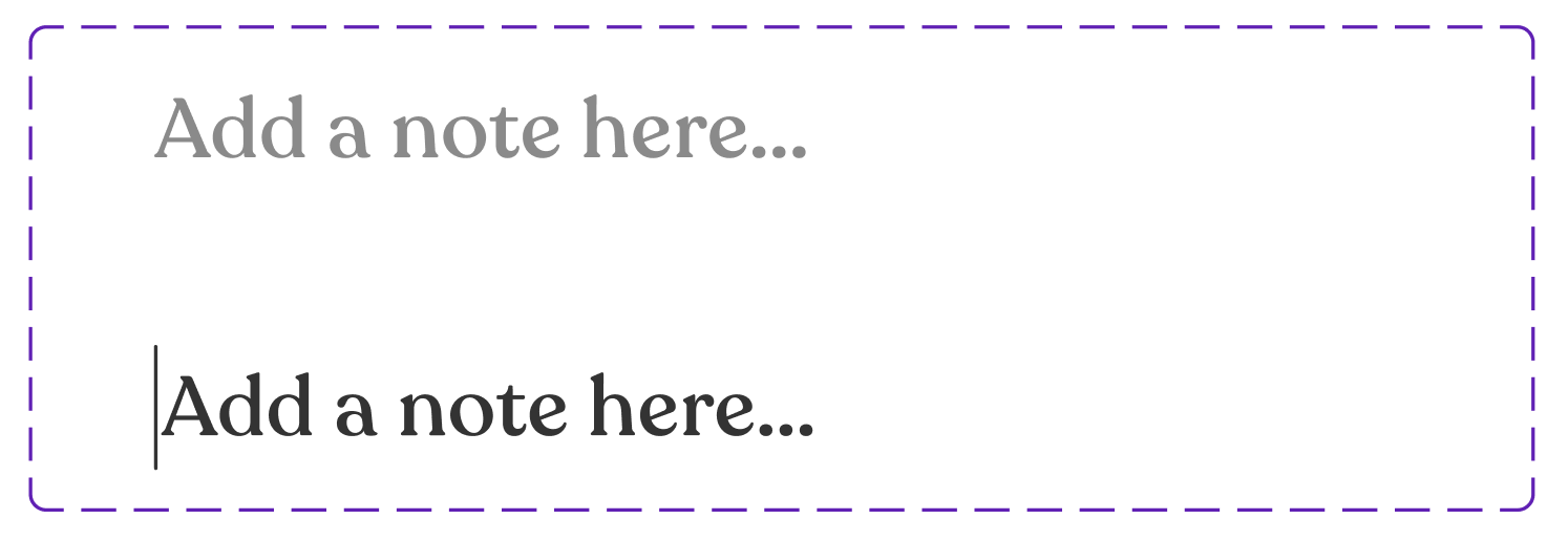
Name details
Visual & Design System
I developed a comprehensive design system with reusable components and consistent spacing. This ensures visual cohesion across the app while making it easier to scale and iterate as the product evolves.
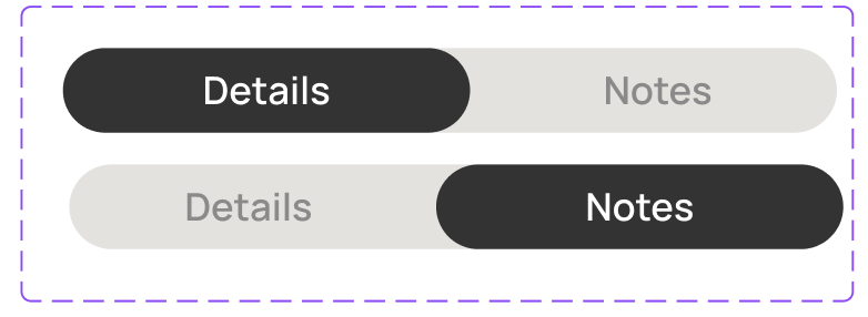
I chose neutral tones and hand-drawn illustrations to create a calm, approachable aesthetic. Since naming a child is inherently emotional and often overwhelming, the visual design prioritizes clarity and comfort over stimulation.
Origins
John
Quran • Arabic • Peace

Aisha
Bhagavad Gita • Sanskrit • Duty
Maria
Bible • Hebrew • Love
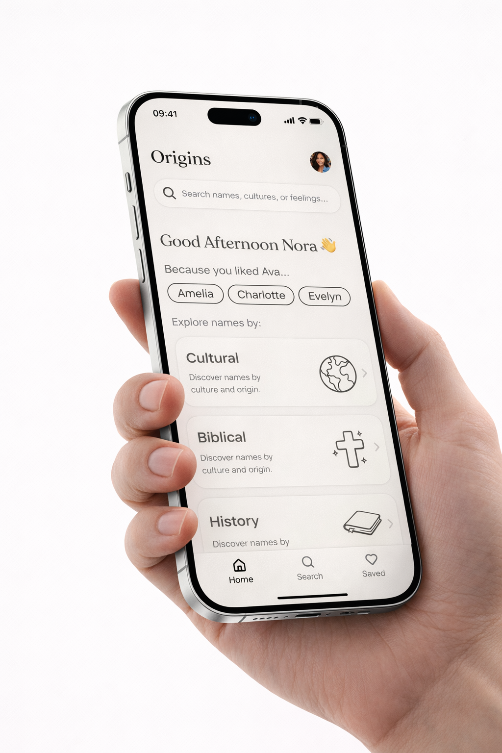
O
Work in progress
Origins is currently in development.
This case study captures the design process so far.
Additional flows, features, and user validation will be documented as the product evolves.

Designing meaning into baby names
A concept app that turns an overwhelming decision into
a guided, emotional journey.
Role: Product Designer
Tools: Figma, Claude
Timeline: 4 weeks
Year: 2025
How the idea started
I was talking with a friend (who's also a developer) and somehow we got on the topic of baby names. We started throwing out names we liked, and within minutes realized we couldn't really explain why we liked them.
Was it the sound? The meaning? Something else?
If we couldn't figure this out in a casual conversation, what's it like for people actually naming their child?
I tested existing baby name apps. They were all the same: alphabetical lists with no guidance or meaningful context.
The problem was clear. We decided to build something better together.
My role
Led end-to-end research, interaction design, and a full design system to explore a more guided, meaningful experience.
The team
I collaborated closely with a developer, using Figma Dev Mode and Cursor to keep the implementation aligned with the design system and interaction details.
The challenge
Naming a child is deeply personal. Yet most baby name apps treat it like a database.
After testing existing apps I found out problems across existing apps:
- Overwhelming alphabetical lists with no guidance
- Generic, repetitive name meanings
- Missing cultural and symbolic context
- No clear path for exploration
The question became:
How do we help parents discover names that actually mean something to them, instead of just scrolling through endless lists?
Understanding the Problem
I began by validating early observations through a competitive analysis of the most popular baby name apps. Despite different interfaces, most products relied on the same pattern: A–Z lists, basic filters, and swipe interactions with little context.
This confirmed that the core issue wasn’t a lack of options, but a lack of structure and guidance.
I started with competitive research, testing and reviewing existing baby name apps and online resources. Most products relied on alphabetical lists, popularity rankings, and generic filters, with little context.
I then researched how people naturally talk about names across forums, articles, and discussions.
I noticed that names are often described and grouped by culture, religion, and historical context.
These themes appeared repeatedly as reference points people use to explain and explore names.
Based on this, I identified cultural, religious, and historical context as the primary entry points for exploration. These categories became the foundation for the first low-fidelity prototypes.
Low-fidelity exploration
I started by sketching different ways parents could begin their search, like a search bar, browsing by letter, or choosing from categories.
Category based exploration felt more intentional and guided. Instead of aimlessly scrolling, users could choose a direction that resonated with them.
The approach
Based on what I learned from early testing, I focused the design around three key principles:
Start with themes, not lists
The app starts with themes instead of alphabetical lists. Users choose a direction: biblical, cultural etc, then explore names within that context. This gives structure to what's typically an overwhelming decision.
Clear entry points into exploration

You start with broad themes, so you're not staring at a blank search box wondering where to begin. Pick a direction that feels right, then go from there.
Stories, not summaries

Each name includes its origin story, cultural significance, pronunciation guide, and connections to related names.
Instead of just "Maria" users learn about its biblical roots, cultural variations, and why it resonates with different cultures. This gives parents the context they need to make an informed, meaningful choice.
Designing with relationships in mind
As meanings, origins, and cultural context emerged as core user needs, I collaborated with the developer to explore how this information could stay connected beneath the interface.
We used a knowledge graph to map relationships between names, origins, symbolism, phonetics, and related concepts helping us think beyond isolated name cards and toward a system designed for discovery.
Final Designs
Here's how the experience comes together across the core screens:
Home screen
Search & Explore
Browse names
Category exploration
Filters
Name details
Visual & Design System
I developed a comprehensive design system with reusable components and consistent spacing. This ensures visual cohesion across the app while making it easier to scale and iterate as the product evolves.
I chose neutral tones and hand-drawn illustrations to create a calm, approachable aesthetic. Since naming a child is inherently emotional and often overwhelming, the visual design prioritizes clarity and comfort over stimulation.
Origins
John
Quran • Arabic • Peace

Aisha
Bhagavad Gita • Sanskrit • Duty
Maria
Bible • Hebrew • Love
O
Work in progress
Origins is currently in development. This case study captures the design process so far.
Additional flows, features, and user validation will be documented as the product evolves.


Designing meaning into baby names
A concept app that turns an overwhelming decision into
a guided, emotional journey.
Role: Product Designer
Tools: Figma, Claude
Timeline: 4 weeks
Year: 2025
How the idea started
I was talking with a friend (who's also a developer) and somehow we got on the topic of baby names. We started throwing out names we liked, and within minutes realized we couldn't really explain why we liked them.
Was it the sound? The meaning? Something else?
If we couldn't figure this out in a casual conversation, what's it like for people actually naming their child?
We tested existing baby name apps. They were all the same: alphabetical lists with no guidance or meaningful context.
The problem was clear. We decided to build something better together.
My role
Led research and high-fidelity design across product, brand, and website, supported by a scalable design system.
The team
I collaborated closely with a developer, using Figma Dev Mode and Cursor to keep the implementation aligned with the design system and interaction details.
The challenge
Naming a child is deeply personal. Yet most baby name apps treat it like a database.
After testing existing apps I found out problems across existing apps:
- Overwhelming alphabetical lists with no guidance
- Generic, repetitive name meanings
- Missing cultural and symbolic context
- No clear path for exploration
The question became:
How do we help parents discover names that actually mean something to them, instead of just scrolling through endless lists?
Understanding the Problem
I started with competitive research, testing and reviewing existing baby name apps and online resources. Most products relied on alphabetical lists, popularity rankings, and generic filters, with little context.
I then researched how people naturally talk about names across forums, articles, and discussions.
I noticed that names are often described and grouped by culture, religion, and historical context.
These themes appeared repeatedly as reference points people use to explain and explore names.
Based on this, I identified cultural, religious, and historical context as the primary entry points for exploration.These categories became the foundation for the first low-fidelity prototypes.
Low-fidelity exploration
I started by sketching different ways parents could begin their search, like a search bar, browsing by letter, or choosing from categories.
Category based exploration felt more intentional and guided. Instead of aimlessly scrolling, users could choose a direction that resonated with them.
The approach
Based on what I learned from early testing, I focused the design around three key principles:
Start with themes, not lists
The app starts with themes instead of alphabetical lists. Users choose a direction: biblical, cultural etc, then explore names within that context. This gives structure to what's typically an overwhelming decision.
Clear entry points into exploration

You start with broad themes, so you're not staring at a blank search box wondering where to begin. Pick a direction that feels right, then go from there.
Stories, not summaries
Each name includes its origin story, cultural significance, pronunciation guide, and connections to related names.
Instead of just "Maria" users learn about its biblical roots, cultural variations, and why it resonates with different cultures. This gives parents the context they need to make an informed, meaningful choice.
Designing with relationships in mind
As meanings, origins, and cultural context emerged as core user needs, I collaborated with the developer to explore how this information could stay connected beneath the interface.
We used a knowledge graph to map relationships between names, origins, symbolism, phonetics, and related concepts helping us think beyond isolated name cards and toward a system designed for discovery.
Final Designs
Here's how the experience comes together across the core screens:
Home screen
Search & Explore
Browse names
Category exploration
Filters
Name details
Visual & Design System
I developed a comprehensive design system with reusable components and consistent spacing. This ensures visual cohesion across the app while making it easier to scale and iterate as the product evolves.
I chose neutral tones and hand-drawn illustrations to create a calm, approachable aesthetic. Since naming a child is inherently emotional and often overwhelming, the visual design prioritizes clarity and comfort over stimulation.
Origins
John
Quran • Arabic • Peace

Aisha
Bhagavad Gita • Sanskrit • Duty
Maria
Bible • Hebrew • Love
O
Work in progress
Origins is currently in development. This case study captures the design process so far.
Additional flows, features, and user validation will be documented as the product evolves.
